Introduction
2D charts are created with a similar set of components. The most import of these is the XY series component that allows us to map 2D data to a familiar set of plots.
The XY series takes a number of arguments. For a full list please consult the API docs.
The most important parameter is the type parameter. For 2D charts this can take the following values:
-
SCATTER: This is for a regular scatter series. Can also be used to create a line chart by setting thestyle. -
SCATTERGL: Same as above, but this uses WebGL for rendering, so gives better performance for larger data points. -
BAR: This transforms the series to a bar chart. -
HISTOGRAM2DCONTOUR: This transforms the series to a 2D density histogram contour plot. -
HISTOGRAM: This is used to transform the series to a histogram. -
PIE: This can be used to transform a series to a pie chart. Pie charts can also be composed piece by piece.
Composition
The style of creating charts in Picta is grammatical. A user simply has to declare the the various properties and transformations they would like to be applied to the series. Picta tries to avoid casting plots as special cases as much as possible. This allows the API to be simpler, and once you get the hang of it, making charts becomes a very familiar process.
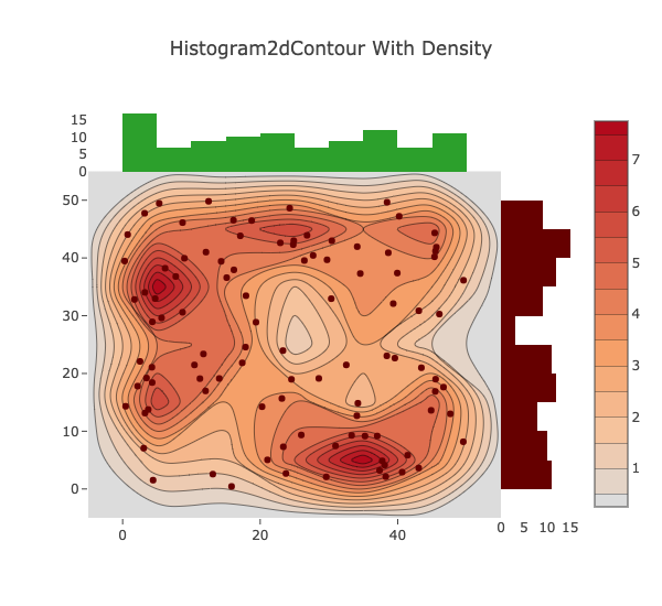
An Example: Constructing a 2D Density Histogram
In order to demonstrate the above examples, the following example will show how to create a 2D density histogram chart that has multiple axes. A fully exhaustive list of examples for each and every chart type would not be feasible given how customizable charts are.
import org.carbonateresearch.picta._
import org.carbonateresearch.picta.options.Marker
import org.carbonateresearch.picta.options.histogram.HistOptions
import org.carbonateresearch.picta.options.histogram2d.Hist2dOptions
// create some dummy data
val x = List.range(0, 100).map(x => scala.util.Random.nextDouble() * 50)
val y = List.range(0, 100).map(x => scala.util.Random.nextDouble() * 50)

val marker = Marker() setColor "rgb(102,0,0)"

val series1 = XY(x, y)
            .asType(SCATTER)
            .drawMarkers
            .setName("points")
            .setMarker(marker)

val hist2d_options = Hist2dOptions(ncontours = 20, reversescale = false, showscale = true)

val series2 = XY(x, y)
            .setName("density")
            .asType(HISTOGRAM2DCONTOUR)
            .setHist2dOptions(hist2d_options)

val series3 = XY(x = x)
            .asType(HISTOGRAM)
            .setName("histogram")
            .setAxes(Axis(X), Axis(Y, 2))

val series4 = (XY(y)
            .setName("y density")
            .asType(HISTOGRAM)
            .setAxis(Axis(X, 2))
            .setMarker(marker)
            .setHistOptions(HistOptions(orientation = HORIZONTAL)))

val ax1 = Axis(X,showgrid = false) setDomain(0.0, 0.85)
val ax2 = Axis(Y, showgrid = false) setDomain(0.0, 0.85)
val ax3 = Axis(X, position = 2, showgrid = false) setDomain(0.85, 1.0)
val ax4 = Axis(Y, position = 2, showgrid = false) setDomain(0.85, 1.0)

val layout = (
    ChartLayout("Histogram2dContour With Density", auto_size = false, show_legend = false)
    setAxes(ax1, ax2, ax3, ax4)
)

val chart = Chart() addSeries(series1, series2, series3, series4) setChartLayout layout

chart.plotInline
The above code will produce something that looks similar to the below image: