Building a Chart
Charts can be built by composing smaller elements together to create bigger ones.
The main components for building charts are:
-
Canvas: This is is the top-level component for representing the display. ACanvasmay consist of multiple charts. -
Chart: This is the component that corresponds to an actual chart (i.e. scatter, pie etc). -
Series: This is the data series that is plotted on aChart.Seriescome in 3 types:XY: This is series data for constructing a 2D chartXYZ: This is series data for constructing a 3D chartMap: This is series data that constructs a Map chart
-
ChartLayout: This configures various parts of how theChartis represented on screen.
Chart may occassionally also make use of the Config component for further configuration. Config specifies whether the plot is responsive.
For the code examples that follow, it will be assumed that the reader is working in a Jupyter notebook.
1. Code Up The Chart
We are ready to construct the first main component for our chart; the Series.
As we are going to plot 2D data, we can use the appropriately named XY series. It will be assumed the reader is working in a Jupyter notebook.
// create some dummy data
val x = List.range(0, 100).map(x => scala.util.Random.nextDouble() * 50)
val y = List.range(0, 100).map(x => scala.util.Random.nextDouble() * 50)

// create a 2D series
val series = XY(x, y) asType SCATTER drawStyle MARKERS

// create a chart by adding to it a data series. We set the title as 'First Chart'
val chart = Chart() addSeries series setTitle "First Chart"

// if we have a single chart, then we do not need to use the Canvas and can simply call chart.plot
chart.plotInline
2. Admire The Result
Your chart should like something below:
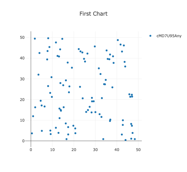
Congratulations! You have created your first chart using Picta. The rest of the documentation will go into more detail about configuration and common examples.